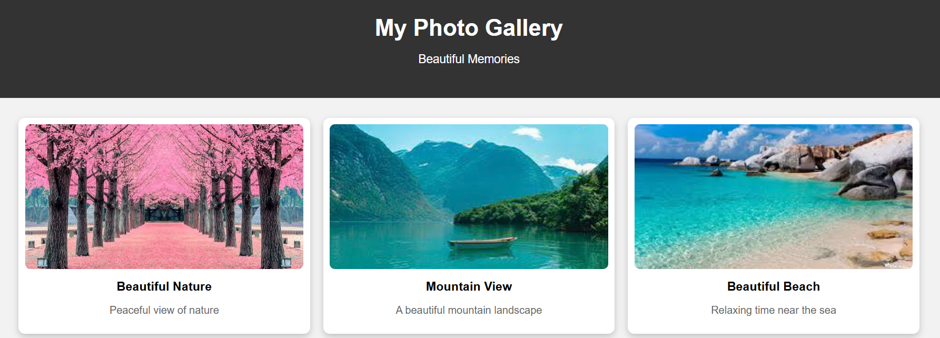
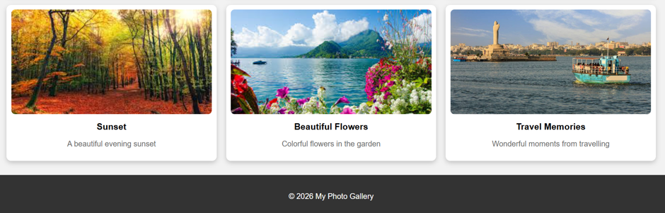
CALENDAR
SOURCE CODE
<!DOCTYPE html>
<html>
<head>
<title>Calendar</title>
<style>
body {
font-family: Arial, sans-serif;
background-color: #f2f2f2;
margin:70px;
}
.calendar {
width: 700px;
margin: auto;
background-color: white;
color:black;
padding: 25px;
border-radius: 15px;
box-shadow: 0 5px 20px rgba(0, 0, 0, 0.2);
}
.year {
text-align: center;
color: gray;
margin-bottom: 25px;
}
.month {
font-size: 28px;
text-align: center;
margin-bottom: 5px;
}
table {
width: 100%;
border-collapse: collapse;
}
th {
background-color: #333;
color: white;
padding: 15px;
}
td {
text-align: center;
padding: 20px;
border: 1px solid #ddd;
font-size: 18px;
}
td:hover {
background-color: #f0f0f0;
cursor: pointer;
}
.sunday {
color: red;
}
</style>
</head>
<body>
<div class=”calendar”>
<div class=”month”>September 2026</div>
<div class=”year”>Calendar</div>
<table>
<thead>
<tr>
<th>Sun</th>
<th>Mon</th>
<th>Tue</th>
<th>Wed</th>
<th>Thu</th>
<th>Fri</th>
<th>Sat</th>
</tr>
</thead>
<tbody>
<tr>
<td class=”sunday”></td>
<td></td>
<td>1</td>
<td>2</td>
<td>3</td>
<td>4</td>
<td>5</td>
</tr>
<tr>
<td class=”sunday”>6</td>
<td>7</td>
<td>8</td>
<td>9</td>
<td>10</td>
<td>11</td>
<td>12</td>
</tr>
<tr>
<td class=”sunday”>13</td>
<td>14</td>
<td>15</td>
<td>16</td>
<td>17</td>
<td>18</td>
<td>19</td>
</tr>
<tr>
<td class=”sunday”>20</td>
<td>21</td>
<td>22</td>
<td>23</td>
<td>24</td>
<td>25</td>
<td>26</td>
</tr>
<tr>
<td class=”sunday”>27</td>
<td>28</td>
<td>29</td>
<td>30</td>
<td></td>
<td></td>
<td></td>
</tr>
</tbody>
</table>
</div>
</body>
</html>
OUTPUT
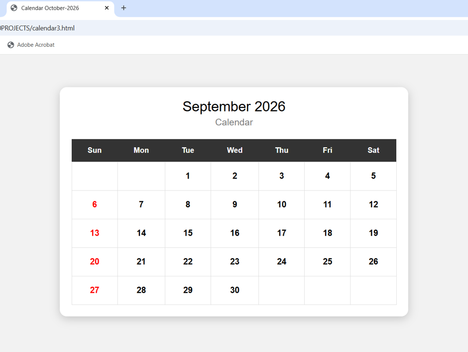
Photo Gallery
SOURCE CODE
<!DOCTYPE html>
<html>
<head>
<title>My Photo Gallery</title>
<style>
/* — Reset & Base Styles — */
* {
box-sizing: border-box;
}
body {
margin: 0;
font-family: Arial, sans-serif;
background-color: #f2f2f2;
}
/* Header */
header {
background-color: #333;
color: white;
text-align: center;
padding: 30px;
}
header h1 {
margin: 0;
font-size: 35px;
}
header p {
font-size: 18px;
}
/* Gallery */
.gallery {
width: 90%;
margin: 30px auto;
display: grid;
grid-template-columns: repeat(3, 1fr);
gap: 20px;
}
/* Photo Card */
.photo {
background-color: white;
padding: 10px;
border-radius: 10px;
box-shadow: 0 4px 10px rgba(0, 0, 0, 0.2);
text-align: center;
}
.photo img {
width: 100%;
height: 220px;
object-fit: cover;
border-radius: 8px;
}
.photo h3 {
margin: 12px 0 5px;
}
.photo p {
color: #666;
}
/* Hover Effect */
.photo:hover {
transform: scale(1.03);
transition: 0.3s;
}
/* Footer */
footer {
background-color: #333;
color: white;
text-align: center;
padding: 20px;
margin-top: 30px;
}
/* Responsive Design */
@media (max-width: 700px) {
.gallery {
grid-template-columns: 1fr;
}
}
</style>
</head>
<body>
<!– Header –>
<header>
<h1>My Photo Gallery</h1>
<p>Beautiful Memories</p>
</header>
<!– Photo Gallery –>
<div class=”gallery”>
<div class=”photo”>
<img src=”D:\Pictures\images (1).jpeg” alt=”Nature”>
<h3>Beautiful Nature</h3>
<p>Peaceful view of nature</p>
</div>
<div class=”photo”>
<img src=”D:\Pictures\images (4).jpeg” alt=”Mountain”>
<h3>Mountain View</h3>
<p>A beautiful mountain landscape</p>
</div>
<div class=”photo”>
<img src=”D:\Pictures\images (6).jpg” alt=”Beach”>
<h3>Beautiful Beach</h3>
<p>Relaxing time near the sea</p>
</div>
<div class=”photo”>
<img src=”D:\Pictures\images (2).jpeg” alt=”Sunset”>
<h3>Sunset</h3>
<p>A beautiful evening sunset</p>
</div>
<div class=”photo”>
<img src=”D:\Pictures\img.jpg” alt=”Flowers”>
<h3>Beautiful Flowers</h3>
<p>Colorful flowers in the garden</p>
</div>
<div class=”photo”>
<img src=”D:\Pictures\Hyderabad.jpg” alt=”Travel”>
<h3>Travel Memories</h3>
<p>Wonderful moments from travelling</p>
</div>
</div>
<!– Footer –>
<footer>
<p>© 2026 My Photo Gallery</p>
</footer>
</body>
</html>
OUTPUT